Kobo’s new e-readers are a sidegrade most can skip (with one exception)

Kobo put out a handful of new e-readers a few weeks back: color versions of the excellent Libra 2 and Clara, as well as an updated monochrome version of the latter. But after testing them all out, I can say that for most users, there’s no reason to switch.
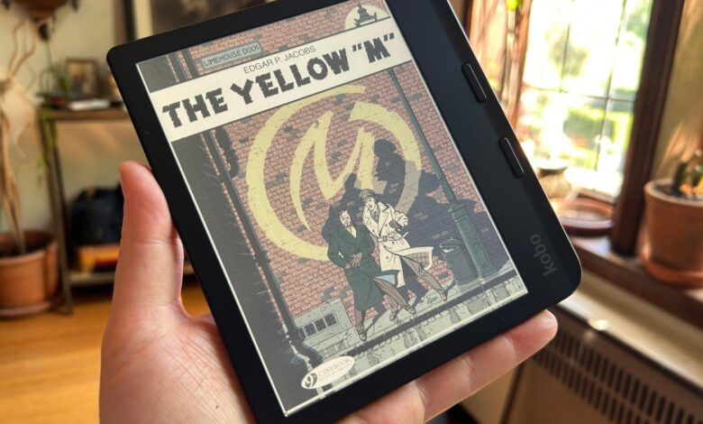
First, the color editions. I’ve been waiting on color e-paper screens for what seems like half my life, and they have yet to achieve the level of vibrancy I’d want in order to really enjoy comics and websites on them. That’s still the case with the Clara Colour and Libra Colour.
These devices use E Ink’s latest Kaleido 3 display, and certainly things have come a ways from what we were seeing 10 years ago. But the simple fact is the color reproduction is still not great. Better than it ever was … but poor compared with almost anything else.
It’s unclear to me why you would want color at all on a 6″ device about the size of a pulp paperback. I tried to read a few comics but the text is simply too small and zooming and panning too clumsy. And the colors, while present, are washed out in every shade. Perhaps a children’s book?
Now, I want to give credit where credit is due: The screen displays a wide variety of colors — I studied one panel in particular that had several distinct but similar shades of blue (not the one below), and I was able to discern them on the reader almost as well as my normal LCD screen. They’re certainly desaturated, but they are there.

These criticisms are all equally true of the larger Libra Colour, the latest in the line of asymmetrical 7″ devices with page turn buttons. That extra inch makes for about as much extra readability as you would expect — a bit — but the screen itself is no different.
You may be thinking: Why not just get the color one so you have the option? You can still read ordinary books, after all. Yes, but … unfortunately, the color layer actually makes black and white content worse.
I compared the Clara Colour and BW side by side — and for that matter, the year-old Clara 2E I had sitting around. While they are all nominally the same resolution, the Colour looks as if there is a sort of light gauze over it, darkening the entire display slightly and as a result reducing the contrast.
This isn’t just some minor thing that one only notices with a microscope. It’s really obvious. The color screens are dimmer and harder to read. I tried and failed to capture it in photos, but trust me, it’s unquestionably a step down.
As such, I simply can’t recommend the color versions of these readers to anyone, unless you have a particular use case where desaturated colors and a slightly degraded reading experience aren’t a big deal.
Now, as for the Clara BW, this is essentially the new default recommendation I’ll be giving — not because it significantly outdoes my go-to reader, the Clara 2E, but because it offers modest improvements for $10 less.
The new version of this very straightforward form factor includes a lightly updated screen, the Carta 1300 series, which boasts slightly better contrast and page-turning speeds. Tested against the 2E, I found it to be noticeably faster when tapping quickly through pages, but not noticeable in ordinary use. And as far as the clarity and contrast, they were about equal to my eye, with a slight advantage going to the new device. My favorite feature is that it doesn’t crash when I plug it into my computer half the time, a Clara 2E habit I’d given up on fixing.
So really, you get what I think is the most practical e-reader on the market for most people, only for $130 rather than $140. No ads, sideload your own fonts and documents, built-in library app, plenty of room to play around and hack. However, if you own a Clara 2E, or even a Clara HD, I don’t think the upgrade is necessarily worth it. Type quality hasn’t improved that much in the last few years.
As before, I recommend getting their faux-leather “sleep cover,” which both protects your device from the usual scuffs and folds into a lovely little stand. I recommend the Cayenne Red color so you never lose it. Believe me, you’ll be glad you spent the $30.
Source link


