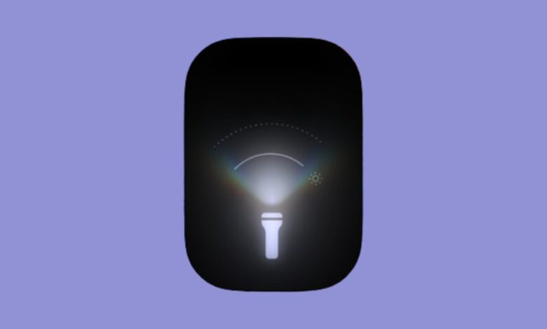
With the latest iOS 18 developer beta, Apple makes flashlight UI more fun

Apple initially added a new flashlight UI in iOS 18’s third developer beta, and with iOS 18 now available in public beta, you can try one of the most underrated additions to your iPhone right now.
The company had already introduced a new way to control True Tone Flashlights on iPhone 14 Pro and 15 Pro models. Unlike the previous controls of on/off and four levels of brightness, the new controls include variable brightness and a way to adjust the width of the beam. The controls in the first beta just had vertical and horizontal lines to represent them, and it took users a second to get accustomed to it.
However, with the iOS 18 developer beta 3, Apple has made the feature and design more amiable and simpler to use. The new design has a curved line to indicate both width of the beam and brightness. The UI also shows a dotted curved lineup top to indicate the peak intensity mark.
This is not a massive change, but it just makes for a fun design shift. As an added bonus, it also makes the flashlight more useful.
The third developer beta brings another design change, automatically converting third-party apps’ icons to a dark shade. Previously, only Apple’s native apps had new dark-tinted icons.

What’s more, the company has added a new dynamic wallpaper that changes colors based on the time of the day.
This story was originally published July 9 and was updated to include information about the iOS 18 public beta.
Source link


